It’s the inside that counts
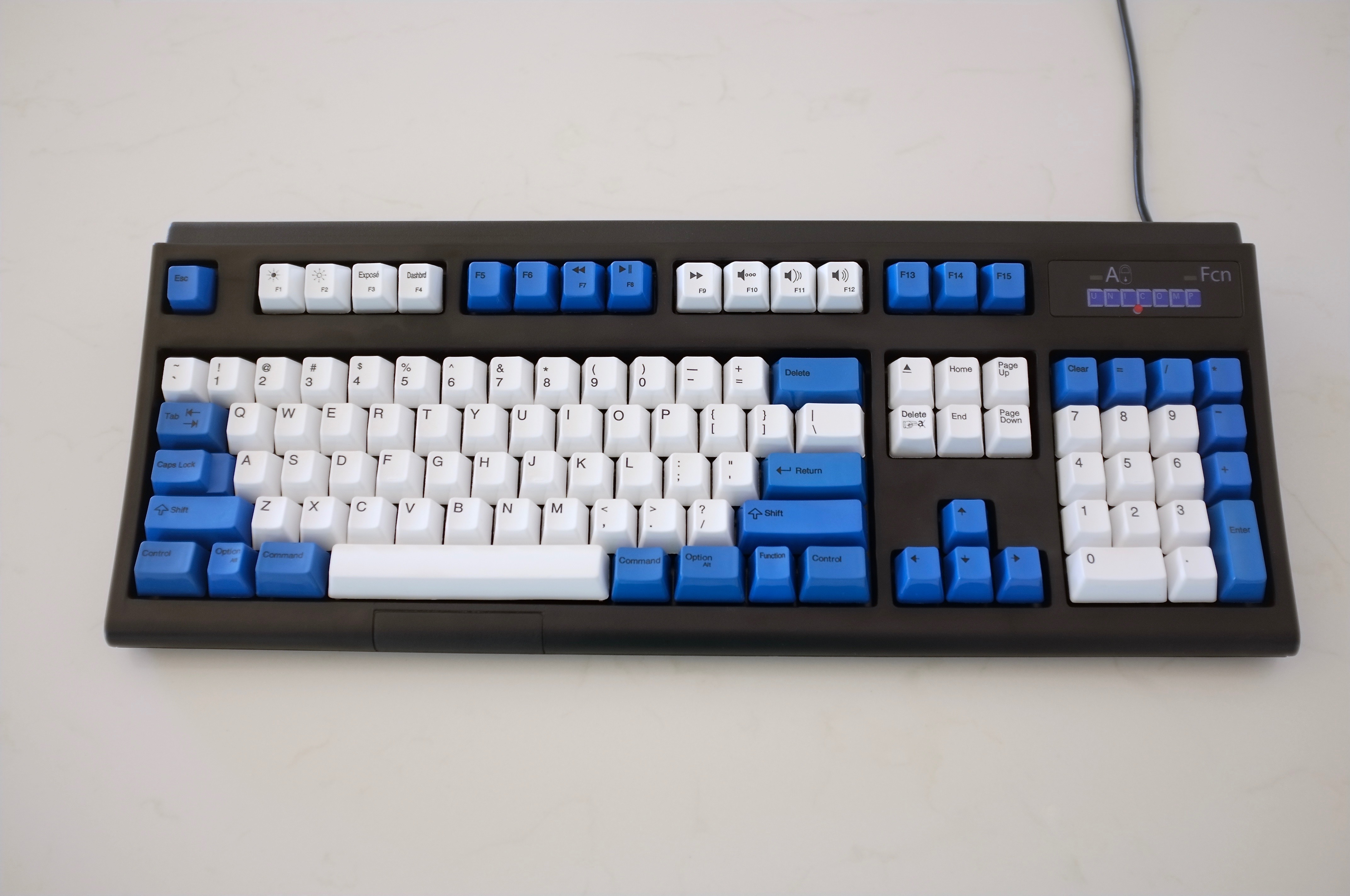
Keyboard Name: Unicomp Spacesaver M Black / Brilliant White
Model Number: UW4ZP4A
Retail Price: $94
Weight: 3.31 lbs / 3.3 kg
Key switch type: Buckling spring
Keycaps: PBT with dye sublimated legends
Keycap thickness: 1.69 mm
A Brief-ish History
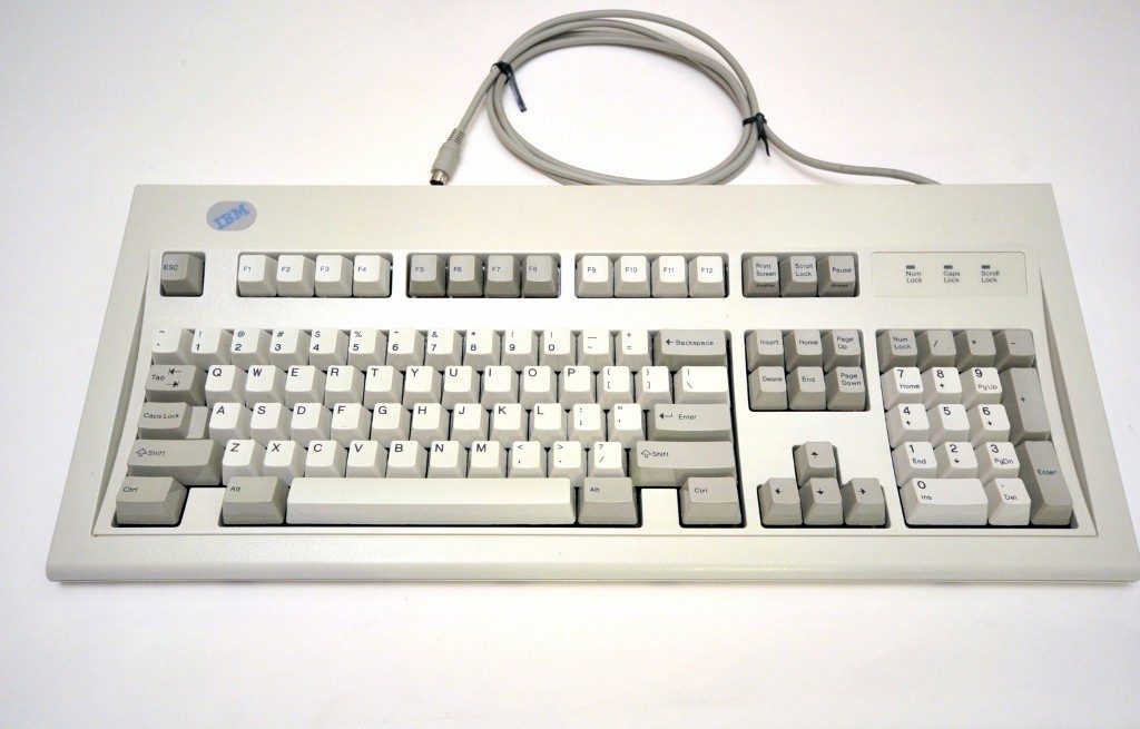
In 1985 IBM introduced the Model M keyboard as a cost-effective successor to the earlier Model F keyboard. The Model M was made and sold from 1985 to 1996. Nowadays, it seems ridiculous to think the Model M was a less expensive alternative to anything. But at the time, IBM wanted to make their keyboards more affordable to home and business users. IBM shaved costs by substituting many of the metal components used in the Model F with plastic ones. They also slightly cheapified the Model F’s “Buckling Spring” over a capacitive PCB key switch by instead, using a buckling spring over rubber and plastic membrane key switch for the Model M (yes, I know this is grossly over-simplified).
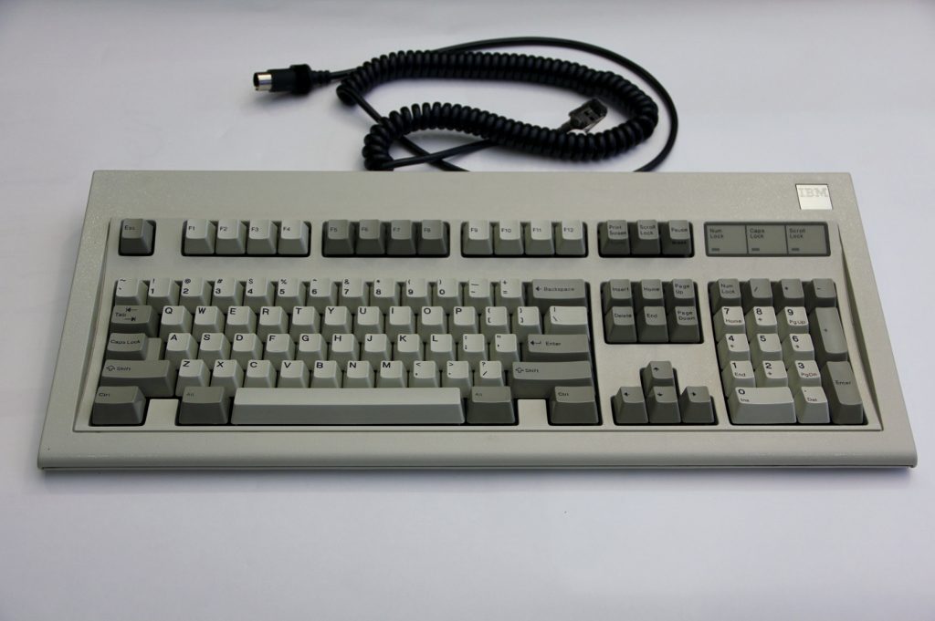
By today’s standards though, the Model M was basically built like a brick shit house and is still widely regarded as the gold standard of keyboard quality and user experience. IBM essentially over-engineered the Model M. Case in point: many people still use Model Ms today. A quick search on ebay will turn up lots of used (and very functional) Model Ms for sale, and even some new-in-box ones.
Model Ms in their various iterations can be characterized by a thick, plastic case, a thick cobalt-plated steel backplate, a nice, thick, detachable coiled cable, durable, removable dye sublimed PBT keycaps and IBM’s famous buckling-spring key switches. Here’s a simple diagram that illustrates how a buckling-spring key switch works:
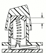
Essentially the coil spring “buckles” under pressure, causing it strike the side of the key switch barrel. Simultaneously the buckled spring drives a pivoted rocker actuator or switch down to create a capacitive action, or in other words, turning the switch from “off” to “on”. These two actions—the buckling of the spring and the depressing of the bottom actuator—give buckling spring key switches their gorgeously unique sound and tactility.
Companies have produced similar(ish) key switches in spirit, like Cherry MX Blues and Blue Alps key switches, and they are sometimes compared to buckling springs. But nothing really comes remotely close to the unique sound or incredible tactility. There is no comparison.
As time went on, Model Ms were progressively cheapened as IBM opted for thinner materials. Also, the aesthetics of the keyboard changed slightly over the years. Then in 1991, IBM transitioned part of their manufacturing business including printers and keyboards to a company called Lexmark in Lexington, Kentucky. Lexmark continued making Model M keyboards under license until 1996, when the relationship ended.
At that point, some of the Lexmark employees formed a new company called Unicomp. They bought the tooling and manufacturing equipment Lexmark had used to make Model Ms. And the rest, as they say, is history.
Unicomps are still manufactured to this day in Lexington Kentucky. You could say that Unicomps are Model M “clones,” but I really think they are real-deal Model Ms, albeit changed over years of design modification. Unicomp markets their keyboards as “the original Model M” and that’s essentially true.
So all of this history and discussion of legacy begs some very legitimate questions to the casual non-keyboard enthusiast? Like, who cares? The answer is because all of this makes the Unicomp a really, really unique, and interesting keyboard.
Review
Note: This review is for the Mac version of the Unicomp Spacesaver. There are some differences between the Mac and PC version, but I think this review will suffice for those thinking about buying either.
Note: for this review, I not only used this keyboard exclusively for 2 weeks prior, I also used this keyboard to write the review itself.
Upon unboxing the Spacesaver M, the first thing I noticed is the heft. The keyboard weighs in at a respectable 3 lbs 5oz. Not too shabby for a keyboard made in 2017. The brown shipping box has no identifying information other than the shipping labels and small Unicomp adhesive label with Unicomp’s logo, ship date, and part number.
Inside it’s the same. A thin piece of loose-fitting plastic wrap, a couple of cardboard inserts, a receipt and some basic information on how to troubleshoot shipping-induced issues. Mine came with additional blue keycaps in the box that I purchased separately. And while the packaging is sparse, it gets the job done. My keyboard had no noticeable damage from shipping and only one loose keycap. Super easy to reattach.
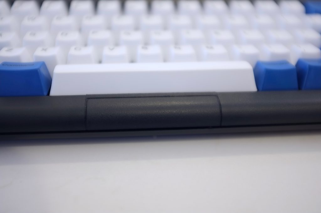
When I picked up the Spacesaver M, I immediately noticed the case felt like it was made of thin, cheap plastic. It squeaked and creaked with the slightest touch—It wasn’t best first impression, and honestly, with just a few additional screws Unicomp could probably fix this problem. As far as I can tell, the case is held together with 3 screws at the top, and probably some plastic clips on the bottom. And the bottom of the case is where the majority of the creaks come from. Once the Spacesaver M is sitting on your desk however, it feels solid, and the thinness of the case is basically a non-issue.
I also noticed a lot of “blemishes” in the plastic. There are shiny spots and depressions that look like Unicom’s tooling might be getting old or damaged. This has been noted by many reviewers in the past, and my keyboard certainly lived up to the Unicomp reputation for poor fit and finish.
There’s also a bizarre rectangle patch just below the spacebar which serves no apparent function. It looks like a vestigial component of previous model M that is no longer needed, but Unicomp never bothered to remove. Maybe someone can can explain to me what that is or why it’s there.
** Update: Geekhack user “csmertx” was kind enough explain the source of this mysterious rectangular patch. In his words, “…the rectangle is there because the Spacesaver M, Ultra Classic, and Endura Pro are assembled with the same casing. The latter model features a TrackPoint and LMB/RMB below the spacebar. Basically a vestige of M13 production.” Details can be found on Deskthority but essentially, it’s a relic of an old mouse button.
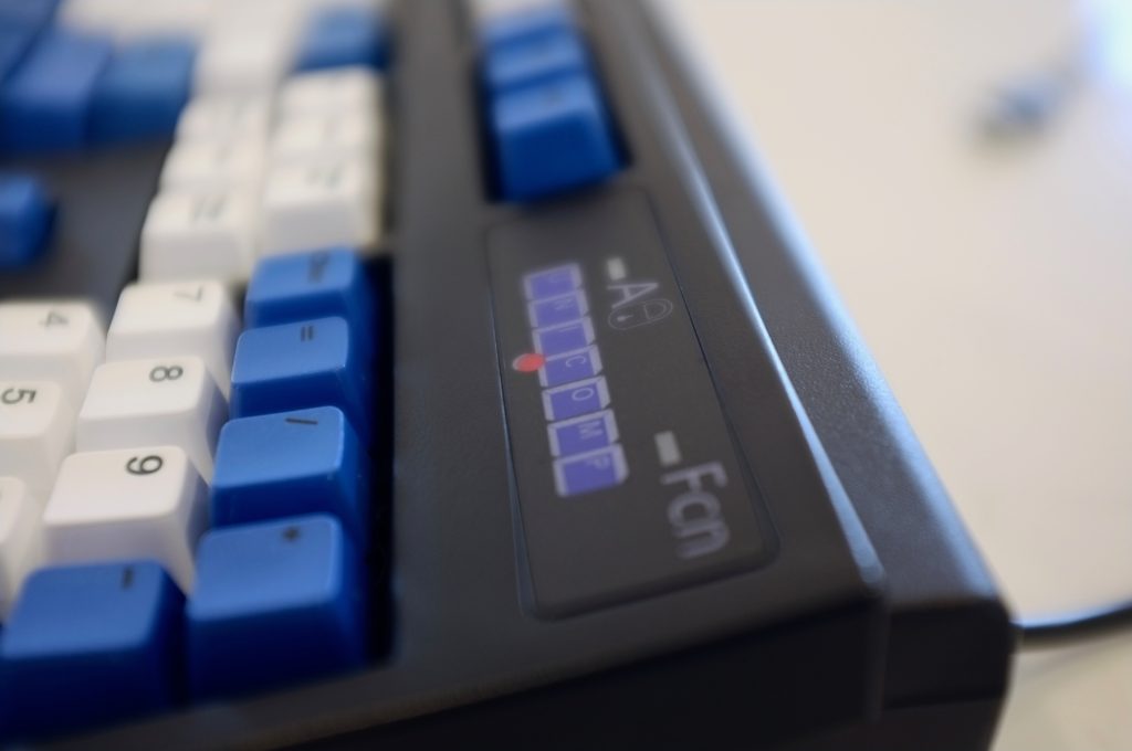
On the top right are a caps lock light and function light. Both are illuminated with attractive, bright blue LEDs, similar to what Topre uses on its Realforce keyboards. Caps lock and function lights are identified with the same label that also features Unicomp’s logo.
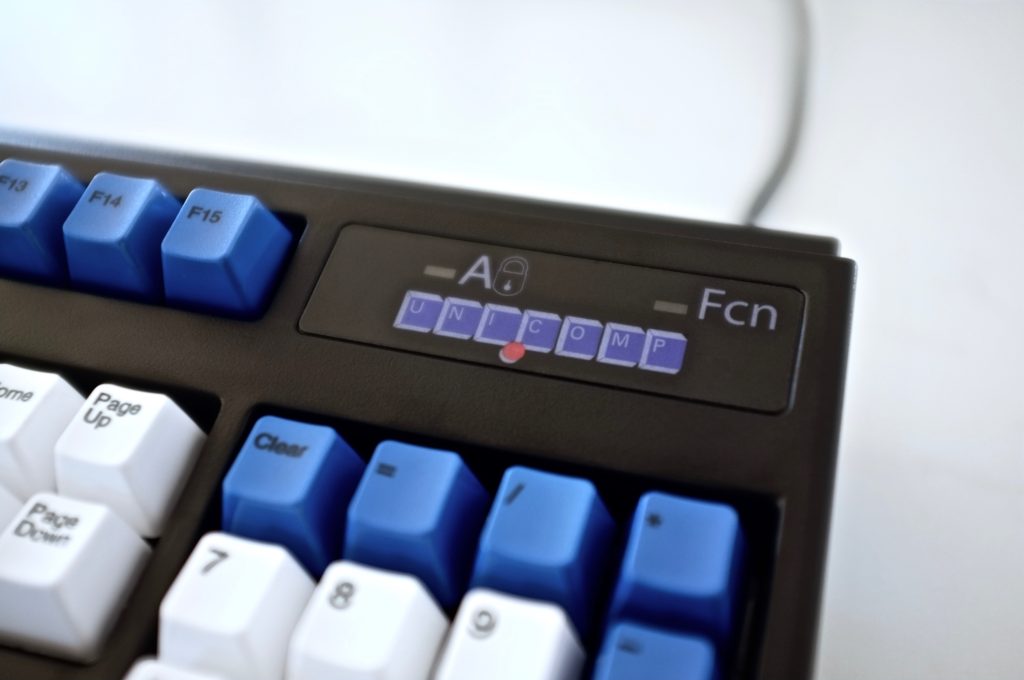
Logo
I’ll preface this by saying I don’t normally fixate on logos, and I mostly feel that logo design can be very subjective. Beauty is indeed in the eye of the beholder. But I kinda feel obligated to talk about Unicomp’s logo. I’ve given this some serious consideration over two weeks it’s basically come down to: Either the Unicomp logo is the most bastard-ugly logo in the grand history logos, or it’s so ugly, it’s actually cool. I’ve considered some theories as to why the Unicomp logo looks the way it does.
Unicomp could be trying to say, “We’re keyboard manufacturers, not graphic designers. See? And, we’ll back it up with even uglier legends on our key caps, AND even more with incredibly bizarre caps lock and function lock symbols next to our logo. Or maybe they’re betting we’ll still buy their keyboards regardless of the logo. Or maybe Unicomp is just totally oblivious and don’t realize that they have an ugly logo, or just don’t really care. I’d love to have someone at Unicomp set the record straight on this matter.
All that being said, after staring at “Unicomp’s” blue unibrow, with that super-weird red dot eyeball, for almost two weeks, I have come to see it in a different light, and with a fonder eye. It now stares back at me and says, “I basically don’t give a fuck about appearances. It’s the inside that counts.” In the end, I respect that. Unicomp should sell logo t-shirts. I’d probably wear one.
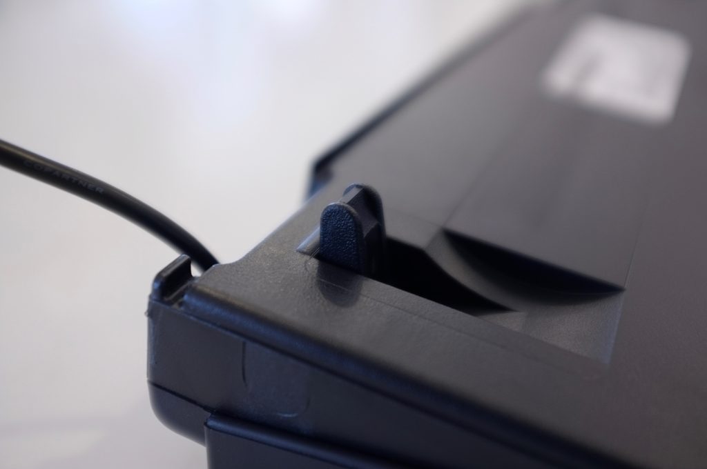
On the bottom of the case are a couple of small rubber pads to prevent slipping, some small flip-out feet to adjust the height, a cheap adhesive label that looks like it was printed on a laser printer with serial number, and a very useful cable management system with “gutters” that allow the attached USB cable to extend from the right or left side of the keyboard. Nice touch.
Layout
The full-size layout is well designed, with a few touches that will make Mac users very happy. First, the function keys go all the way up to F15. In my opinion there is no such thing as too many function keys. True, some keyboards, like Apple’s own full-size keyboards go all the way up to F19, but having 15 function keys is enough and makes the keyboard very useful. Other nice layout touches are the numpad with Equals, Clear, and small-ass Plus keys. Anyone who uses Excel understands how useful it is to have an Equals key on the numpad rather than having to hunt for the one next to Backspace.
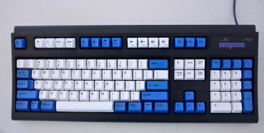
Unicomp was also kind enough to have the proper Command, Option and Control keys in the right locations, as well as various media and OS X keys at the top function row. Lastly they included the semi-useful Eject key (who has anything to eject these days?), and placed the function key logically between Option and Control. All-in-all I’d say this is a legit Mac user keyboard, and I find it very straight forward and functional. It’s certainly not a PC keyboard that was poorly adapted to the Mac platform. It’s the real thing.
Keycaps
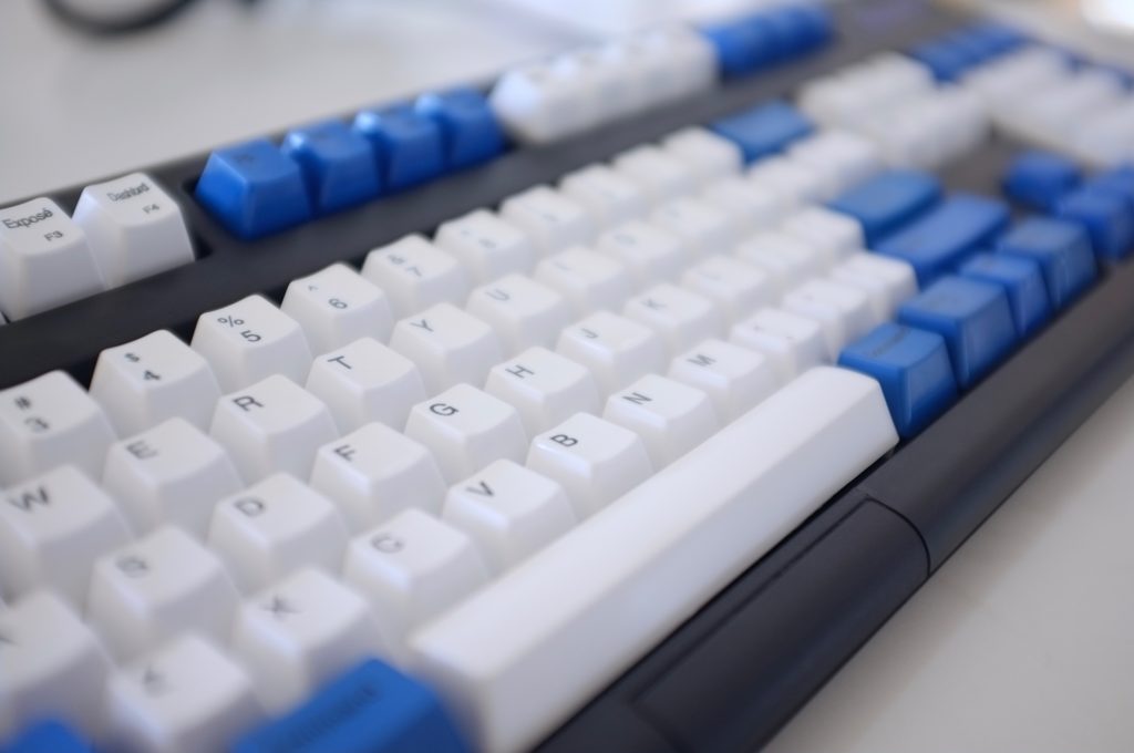
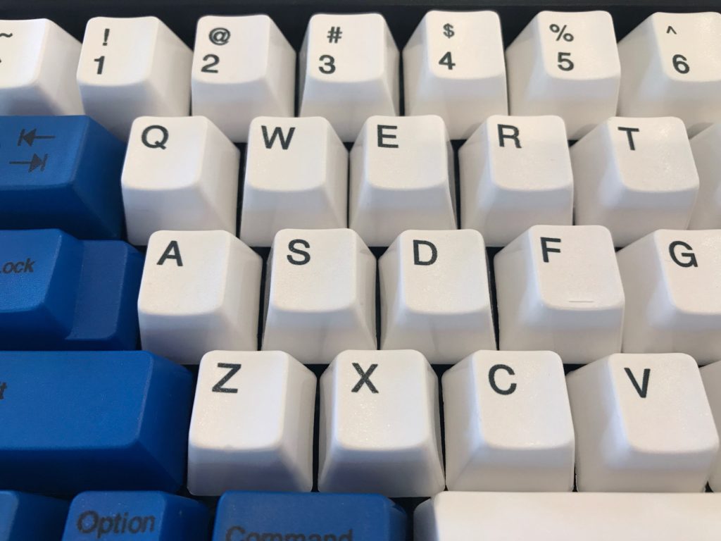
They key caps are excellent—some of the best around. Thick PBT plastic (around 1.69 mm in thickness) with dye sublimated legends. Because the keycaps are durable PBT, they presumably won’t yellow over time or wear with use as quickly as EPS. They are made from two pieces of interlocking plastic similar to the original Model Ms, illustrated below. The characters are sharp and crisp and I especially like the contrast against the white keys. Popping them out and replacing them is about as easy as it gets. Just use a wire puller and with minimal effort they snap out, and in agin.
When I originally received my keyboard, some of the blue keycaps I ordered had lettering and legends that weren’t properly aligned. The worst ones were the Page Up and Page Down keys shown below. Unicomp is renowned for their customer service and they lived up to their reputation on this issue. One email with a photo was all it took to get replacement keycaps in the mail within a few days. Nice.
Key switches
I’ve spent some time talking about the original Model M key switches in the history section so I won’t go too much into the details again. As far as I can tell, these are pretty much the same as what the Model M used. For anyone who hasn’t typed on a buckling spring keyboard, I highly recommend trying one. While hard to describe, I will say the tactility and sound is beyond satisfying. Also, they’re very mechanical and very loud, so probably not the best for a shared office space. I believe Unicomp uses 60-70g springs in their key switches. Not the stiffest on the block, but they provide good resistance and allow fingers to rest on the keys without accidental key presses. Once depressed however, it’s near impossible not to bottom out. I think this is inherent in the buckling spring design. Because the actuator sits over rubber and plastic, bottoming out doesn’t feel harsh or sharp. Instead it’s pleasant and cushioned. And once released, the key rockets back up to the top as it resets itself in the chamber in a very satisfying way. Off-center key presses are zero problem with buckling spring switches. I couldn’t get keys to bind at all, no matter how much I tried.
Because of the unique sensation and long key travel, it took me a couple of hours to get used to typing on the Spacesaver M. At first, my cadence slowed down, partially due to the novelty of the sensation, and partially because each key was so much fun to press—like I was savoring the experience. But after a few days, I noticed my typing speed increased drastically, with fewer errors.
All-in-all, I’d say the key switches are probably the best feature of this keyboard, especially if you do a lot of typing. It’s the closest sensation to an old typewriter I’ve experienced from a modern keyboard. I’m not so sure I’d recommend this keyboard to gamers because of the long key travel, stiffness of the springs, and lack of N-key rollover. That being said, it’s no surprise that buckling spring key switches are still viable today, and I think they are probably the best new switch available on the market for typists, in terms of tactility, reliability, and smoothness.
Sound
Buckling springs are loud. I certainly wouldn’t use the Spacesaver M in a shared office environment, unless it in the company of typewriters or something. And while they aren’t the best absolute best sounding key switches I have ever heard (that title probably goes to complicated Orange Alps), they’re very near the top of my list. To be clear, it really sounds good. Because this keyboard sounds almost like a typewriter, I always feel like I should be in a smoky office environment from the 60s or something. Seriously, typing on this thing makes me want to smoke a cigarette. Cigarette anyone?
I have a theory on what makes a keyboard sound great. A lot of it has to do with the key switches (obviously), but a lot of it also has to do with case design, backplate design, key cap design, and materials used throughout. This makes it difficult to talk about key switches and sound in isolation. A keyboard should produce (in my opinion) a full range of sound to be the most pleasing to the ear, kind of like a pair of good speakers. In simple terms, that means balanced amounts of treble, midrange and bass. Whenever a keyboard produces only narrow frequencies of sound, the audio feedback is either one-dimensional and boring, or downright annoying. Greentech Blues, for example, make nothing but a high-pitched, loud plastic “tick” sound. My review of the Das Keyboard Professional 4 will spend some time discussing them in detail. Five minutes of listening to Greentech Blues and I’m ready to throw my keyboard through a window (or into the nearest incinerator). Good God. Similarly, silenced Topre boards can produce a bassy “thock” that can be a little boring at times. Yes, I know both of these statements are a little polarizing, but to each his own I guess. To me, the magic happens when there’s a full range.
The sound of the Spacesaver M is very satisfying, but it isn’t as deep or bassy as older Model M keyboards and I think it’s probably because of the thin plastics used for the case, and thinner metal backplate. There’s a hollowness or echo that you can hear. Nonetheless, it’s an overall good sound, and hours of typing doesn’t get tiresome or annoying. At the end of this review is a video of me typing on the Spacesaver M for reference.
Summary
Overall, I think the Spacesaver M is an exceptionally good keyboard, and a good value, despite some of its shortcomings. Sure, the thin, creaky, plastic case doesn’t inspire confidence, and the manufacturing quality control could be better. And yes, some the legends and symbols are downright ugly. But after a while, these shortcomings start to become strangely endearing in a weird sort of way. The Spacesaver M also has a lot of really good features that aren’t offered anywhere unless you buy used. A proper Mac layout, extra-thick dye sublimated PBT, keycaps, and a typing experience that is very fun and highly addictive… All for under $100. Plus, I think it’s really cool that Unicomp is keeping the Model M spirit alive, even if it has cut some corners along the way. Yes, you can go out and buy a used Model M, but they aren’t cheap, and they don’t have a completely modern layout, not to mention no USB connectivity. So bottom line, I would certainly recommending using one, especially for those who do a lot of typing and are OK with a lot of sound.
There are a few things that I think Unicomp could change that would make some really big improvements. For instance, a thicker, better made case would make a huge difference. I emailed them a while back suggesting that they make a premium version, with a nicer case but never received a response. At the very least, just adding some additional screws to the case would help. The addition of a detachable USB cable and some additional USB ports would be fantastic and probably wouldn’t add a whole lot of cost. Lastly, Unicomp should probably hire a graphic designer to spend a little more time on some of the key legends and super awkward Caps Lock and Function Lock light symbols. Heck I’d do it for free if they asked. Just don’t touch that Unicomp logo!
Thanks for reading my review. I hope it was informative, helpful and enjoyable. Below is a video of me typing on the Unicomp Spacesaver M.
I Love It! Thanks for all the helpful info!
I’ve used a Unicomp Spacesaver M here for nearly five years, just like the one you reviewed except that I have the older beige and darker-beige (sort of gray-tan?) keycaps. I agree with almost everything in your review, with one exception.
“While hard to describe, I will say the tactility and sound is beyond satisfying.”
I find it stiff, clacky-and-clunky. When I bought mine, I thought the “legendary” Model M would take me back to those great IBM PC keyboards that I remembered from school, with the cast-metal case and exquisite key action and sound. The Unicomp ain’t that. Now, of course, I know that the ones I so fondly remember were actually Model F.
I agree that when compared to the old Model Ms and Fs the current Unicomps leave a lot to be desired on many levels. But comparing it to keyboards built today, I think it really stands out. I do have really high hopes for the new Model F project: https://www.modelfkeyboards.com/
I have a Unicomp Customizer 104, the original big mama, modeled after the Model M. Since it’s older (2010), it has the gray keycaps. I absolutely LOVE this keyboard. I also feel that the “blemishes” add to it. The board just wouldn’t be right if it were flawless, in my opinion. I constantly find myself using it as my daily driver. Nothing beats that Buckling Spring feel. The only switches that come close are the Matias Click switches.